Thursday, October 7, 2010

Lunchbox Jealousy

It’s been a mighty busy couple of days...couple of weeks. David Sedaris, Nuit Blanche, St. Lawrence Market and all kinds of autumn Toronto fun. I have a couple Fall thematic blogs in the work but while cruising my design weeklies I came across a blip on JOOZE. Yup, sound it out, think of younger years, lunch boxes and sticky puddles on your desk. Juice boxes are or should I say were an integral part of our midday rituals.

Photo Credit:
http://www.lostateminor.com/2010/09/27/jooze-juice-cartons/

Portable, virtually indestructible and vibrantly branded, juice boxes are all about function. That was until I set my eyes on Yunyeen Yang’s Jooze boxes. An Australian design student, these fruity packages conceptions were inspired from a school project. These boxes beckon thirsty tikes with bold colour, fruity depictions on carefully crafted crescents in which to spike a coordinating straw. While my mom was more in favour of the reusable leaky beverage containers in my lunch box, Jooze quenched my design thirst. I did a quick search on jucie boxes in general in what I expected to be a one note blog entry but was thrilled to discover some other goodies to share.


http://www.madehow.com/Volume-7/Juice-Box.html
 FYI: A juice box is recognized as an individual-sized container, whose volume typically holds 4-32 oz of liquid and is accompanied by a straw. A juice box is an aseptic container, meaning it is manufactured and then filled in sterile conditions. It does not require refrigeration or preservatives to remain germ free, a patent design by the Sweed Ruben Rausing in 1963. The conception stemmed from the need to create a more travel friendly container for milk, smaller and less cumbersome than a metal canister. He developed a brick-shaped box coined Tetra Brik, rectangular in shape allowing for stackability and more compact transport. He also developed the sterile conditions for the filling process – aseptic. It wasn’t until the 80s that this design migrated to North America and consumed 20% of the market by ’86.

Juice is a bit of a fickle drink as its ingredients are predominately artificial flavours and tons of sugar. Added vitamins like C and D were introduced in the 90s to bring a healthy dose of nutrition to these fruity drinks. The barrage of health conscious trends in the past 10 years has also promoted some additional changes to drink content. Fewer calories, natural flavour and a variety of new ingredients are packaged into these little bricks including soy and other non-dairy bevies, all natural ingredients and portable protein punches. Not just for youth lunches, these mature off springs offer a variety of drink options for kids of all ages.

I won’t get too much more in depth with the history and manufacturing of juice boxes, madehow.com has a very comprehensive synopsis. Instead I offer up a delicious selection of mod boxes which can not but help entice a thirst for drink and design.


Juice Boxes (Images courtesy Toxel.com)
Created by Japanese industrial designer Naoto Fukasawa
In case you're not a juice fan

http://theskrilla.com/2010/08/27/birdy-juice-boxes/


Straws were always a pain in the butt,
why not omit them all together


Conceptual cuties with a slight jungle juice feel


Wednesday, September 29, 2010

Brick Works is Forever Green


<><><><>
<>
<><><><>
Kiln Brick
 
The forecast had called for rain all weekend. After postponing plans on Saturday for the impending downpour, which never arrived Sunday was not to be neglected. A brunch, 20-minute stroll and a free bus ride later brought us to the grand opening of Evergreen Brick Works. Over 30 years in the making this heritage site has officially opened it’s doors. Showcasing a variety of venues, outdoor activities and community events, this off the trail city destination is giving life to the lower Don Lands.
For almost a century the original infrastructure fired out over 43 million bricks in its lifetime – Casa Loma, old City hall and thousands of homes. Retired in 1989, the city and the province both agreed that this historic location needed to be revitalized and enjoyed by the public. The quarry in particular was recognized by as an Area of Natural and Scientific interest. The 90’s raised $6 million to regenerate this acreage to a more natural state, opening to the public in 1996. Hiking trails snake throughout the site offering lots of picturesque views of the Don Lands ablaze in Fall’s colourage.
Strolling the grounds, the collective of friends, families and community ooze from each corner you turn. Drums beats echoed through the open-air pavilion shared by the Evergreen Gardens. Corn roasts away as volunteers tantalize visitor’s taste buds. This tree-hugging mecca offers bike rentals, workshops, a Saturday morning farmer’s market and Sunday morning yoga classes. Outward Bound Canada has created a climbing tower and active challenge space, art exhibits are showcased in the Kilns and historic brick-works artefacts are preserved throughout the venues.
Diamond + Schmitt - Centre for Green Cities
With all this being said, the big reason I wanted to check out this green gem was the rumour of a LEED Platinum building. Currently only 14 projects have achieve this level in Canada, scoring points in all 5 categories of sustainable performance:
§        Sustainable site development
§        Water efficiency
§        Energy efficiency
§        Material selection
§        Indoor environmental quality
D+S Ariel view of the Site
While still unofficial, this forecasted achievement will be shared in Toronto by only one other building, the Knoll Showroom. However in Canada, this project named the Centre for Green Cities will be the only Platinum LEED heritage site. In researching this building’s development, I was and was not surprised to learn that is was designed by Diamond + Schmitt. You may recognize their work with such buildings as the Four Seasons Centre for the Performing Arts, Corus Quay Building, Toronto Central YMCA and the up and coming One Cole – Regent Park Revitalization (which is another blog in it’s self, promise).
The Kilns
Centre for Green Cities highlights include a 65% reduction in overall fossil-fuel energy. Operable windows, solar chimneys, energy harvesting, solar thermal hot water heating and solar photovoltaic electricity generation to help subsidize. Water conservation will include collecting water, reducing stormwater runoff and improving the quality of stormwater effluent. A minimum of 20% materials will be sourced locally including manufacturing; a 100% of the wood used is sustainably harvested. A zero-waste to landfill plan entails on-site composting, diversion of recyclables from dumps and closed-loop supply chains. Plus a soon to be green roof is in the (brick)works, can a get a woo-hoo here?? WOO-HOO!
            I had attempted to summarize what this place was all about in an effort to entice a less than convinced boyfriend to join my excursion. At a slight loss of words I opted for “It’ll be a surprise” and “one you’ll like, I promise”. A little uncertain as we both worked on navigating our route of travel to the area, it turned out to be a perfect Sunday afternoon in the city…or should I say nature?! Still feels a bit odd when you can see the beads of cars roaring along the DVP from the parking lot. However we both walked away content…luckily grand opening came accompanied by yummy oatmeal pumpkin cookies, a platter of charcuterie, wine and spirits au gratis.
            Evergreen Brick Works is a fresh addition to Toronto’s repertoire of cool places to check-out. I can’t pinpoint one category of activity as it literally has encompassed a handful, park, museum, cafĂ©, art gallery. The Centre for Green Cities was not quite completed on our visit but I look forward to heading back for it’s own grand opening. Whether you’re looking to kill an afternoon or find a place for the kids to run around for a while, this is a top notch destination. I’m super excited for the ice-rink instore come winter time….althought not so much for winter.
Arts Pavillion
Hopefully, I’ll see you there next Saturday for some local grub and a stroll through the panorama quarry.

Lobby of the Centre for Green Cities
Outdoor Garden Space, Ice rink planned for the winter

Sunday, September 26, 2010

IIDEX September 23 - 26, 2010

"Design is not just what it looks like and feels like. Design is how it works." -Steve Jobs


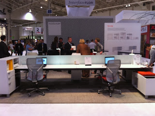
BRC - Office System...with Sustainable Elements

Another school year has started meaning another summer has come to an end. I say this like I've been in school consistently since kindergarten but somehow it feels as though I had never left. As I fall back into routine, and Fall starts to unveil cool temperatures and shorter days so comes another IIDEX show.


Gorgeous Lighting from Egypt, this is on
my Christmas list for sure!

This is my third year attending. The first year I had only just applied to school and I remember walking through the aisles hopeful of my entry into this amazing world. Last year it was mandatory and I stood in line with all the other first years patiently waiting for my badge. This year, I feel like I’ve graduated and can confidently stroll the grounds with swagger.

Amazing Leather hides from
Netherland's EBRU
IIDEX is the industry’s yearly convention and mainly focuses on office and commercial design trades. This year IIDEX also included a Green Building Festival and Light Canada showcase. It is a little more laid back I find in comparison to IDS as all the exhibitors ultimately are salesmen. They are always focused on the ABC (Always Be Closing) and thus even as a student they see the opportunity to share their pitch on the benefit of a $60 LED bulb.
Teknion's Vignette - I'm this chic in theory

Overall it was a relaxed couple hours cruising the lane ways, chatting up on new products and winding down with some free hooch. Teknion’s new Vignette seating and table collection provided the perfect perch after several hours on one’s feet.


Decotone Surfaces - This backlit
wave was stunning in person

Richelieu's Bling Bling Hardware


Bomb tiles...sadly couldn't narrow
down a distributor in Canada...cruel tease

Humanscale's amazing Liberty Task Chair -
it honestly feels like you're sitting in a hammock!


Allsteel's Stride Office System - the scary part is that they say it can fit four people per desk...might be more aptly named Sardine


Green Oasis over in the Green Buidling Festival


EBRU's amazing carpet selection


Thursday, September 16, 2010

I've always wanted a purple fridge!

It's true. The purple obsession is nothing new in my world, ask anyone who knows me. Purple jeans, purple drink, purple backpack and I've even stayed at the Purple House in Panama. Purple is to me what blue pinstripes is to the male suburban clubber....essential in life.


After spending a rather long night hung over foam board, white glue and an exacto knife, I unwound on my 6:55am train with some quality design reading. To my delight Contract’s weekly newsletter showcased an appliance company offering customized colours. SAY WHAT?? I can now get a fridge in any pantone colour? It’s a rainbow brite dream come true.


I did a quick Google search to see if there were any purple fridges currently available. Purple Punch showcased a Black and Decker bar fridge in a saturated royal purple. I also found this customized purple monster on fellow blogger Eat Yr Fridge, chomp chomp. But other than that the findings were slim.


In terms of a quality residential/commercial standard unit Summit seems to have peaked the market. Offering a wide line of appliances customers now have to option to customize the finished colour. The possibilities are endless, mix and match, camouflage to its surroundings, the only limit is your imagination.


I desperately tried to seek some decent images, showcasing this custom colourization but I failed...It seems an orange freezer is territory not yet explored. Sadder still the website only provides a colour chart to peruse instead of a virtual application. Your imagination will have to work in over drive on this one until I get a chance to make concept reality. I’m envisioning a gorgeous granny smith apple green (RAL 6018) wine chiller and a sunny yellow (RAL 1018) beer froster pairing. However being this a rainy Thursday morning, if my fridge was a Summit mood ring, I’d be RAL 7000.

Monday, September 6, 2010

A Stop By the Blue Banana


For those of you who’ve been following, you may have noticed the past couple of posts haven’t made it out on a Sunday as promised. I’m fairly well organized but Summer tends to have the ability to put a wrench in good intentions. It’s the last long weekend of said Summer and with Hurricane Earl sending some down right chilly conditions, the beau and I opted to stay in town. Instead of soaking up some last rays of sun I get to spend it with you and  a lazy Sunday roam of a vibrant retail local in Toronto.
In typical Sunday form, the boyfriend and I headed out around noon for some brunch. Planning on a feast at Aunties and Uncles, we made a change plans when the relatives turned out to be out of town. Opting to back track to Caplansky’s, we made some tentative post-meat plans while awaiting our smoked meat hash. While I strongly pushed for a trip to the ROM, the peaking sun deterred me to wander outside versus in.
Kensington Market is a neighbourhood in Toronto where you can make a quick errand or just as easily spend a few hours. It comprises a couple principle intersections including Augusta and Kensington running north-south and Oxford, Nassau and Baldwin running east-west. I’ll work on a proper Kensington blog but for today I’m providing all you knick-knack loving, hand crafted crafters and kitschy kitcheners a snap-shot feast from the Blue Banana.
Blue Banana operates a market mecca in which merchants can rent space to hock their wares. Ranging from toys, clothes, jewellery, art and food stuffs this 2 storey building is a modern day treasure trove. It’s the one place where you truly could find something for that special person that doesn’t need anything…shout out to all those Dads out there! I recommend the beer-butt chicken spices or a selection of choice hot sauces as a good place to start.
There’s a little something for everyone, which I can vouch for as my boyfriend easily occupies his time while waiting on me to make a round. A possible nibble on some homemade marshmallows, MC ice cube trays and hugging salt and pepper shakers to name a few of today’s highlights.
With some many trinkets I highly recommend a pit-stop as birthdays, holidays and no-reason-at-all-days rise to occasion. Today I came across a few goodies I wanted to share with you, happy perusing J
Reuse Chic
I just saw these on the Grassroots blog
Personalized time
Cardboardermy
Super cute owl pillows
Pop Icon Babushkhas
Signature Underwears
Big fan of repurposed vinyl

The King of Pop

Girly Fridge Decor

A little spice for later
Pretty Pottery
A Snack on the way out!

Thursday, August 26, 2010

A Sweet Preview - Bayfront makes a Sugary Introduction to the East Side

The Vision


I have to admit I’m on a bit of a roll this week. Maybe it’s the impending start of school, a 3-week hiatus from blogging (guilty!) or my boyfriend’s new Xbox but I seem to be keenly motivated these past few nights. Before sitting down to write yesterday evening I’ll admit I took a long procrastinating bike ride home from work. It was a gorgeous blue skied evening and while I had made a date with my laptop to knock out A Bistro Affair, I couldn’t deny myself a little cruise.
East Queens Quay has for as long as I can remember been a sorry state of affair, offering little to the city, the community or visitors. It was a friend at work who mentioned a recent development along the lake, which sparked my curiosity. I googled “Sugar Beach” and ended up reading a bunch about this starting point for the Bayfront project set to conquer this lack lustre 55 acres. I had recalled hearing about the project a year ago but talk is one thing, standing on a sandy white beach beside an impending Gold LEED building is quite another.
Zipping east I was sceptical of my impending destination. Lake Ontario and the city of Toronto have had a less than glamourous relationship. Whereas most cities showcase their shoreline real estate and those who are landlocked will create some sort of man-made water feature. Toronto has snubbed the shores of this great lake, making it feel inferior to its modernized high-rise superiority. However as I passed Red Path and swerved around the temporary fence I suddenly found myself in a little utopian slice of waterfrontage.
White sandy beach, pretty pink umbrellas and low riding Adirondack chairs spread out before me. Where there could have been palm trees, weeping willows swayed gently in the evening’s breeze. The lake glistened proudly in the background in shades of cobalt blues as white sailboats casually cruised by.  A quiet crowd of locals spread out amongst the strip enjoying a relaxed moment in the warm August sunset.
Reading up on the park I discovered that for a mere $14.3 million dollars they were able to transform this space into a sweet urban escape. Sand from Ohio, granite from northern Quebec, black and white cobble stones, maple, white pine and willows are a few of the natural elements used to construct this project. I appreciated the Adirondack chairs designed by Loll but was particularly excited by the Ipe slat benches. Unlike typical street seating these oversized wavy creations offered ample uninterrupted seating for users. No armrests break up the length, allowing for luxurious lounging over its gentle curves. It’s the perfect spot to curl up with a friend and enjoy the views.
The entire project is broken into 3 sections, the beach, the promenade and the plaza.  Claude Cormier Architectes Paysagistes won the 1997 design competition by designing a dynamic, playful destination with signature elements. Green highlights include the use of recycled content in construction materials, LED lights, stormwater management systems beneath the plaza and proximity to public transit systems. These elements are part of the Waterfront’s larger goal of achieving LEED ND GOLD (Leadership in Energy and Environmental Design for Neighbourhood Development).
Promenading further east I was also able to take in the nearly completed TEDCO-Corus Office Building. It was designed by local architectural firm Diamond & Schmitt with Aecon awarded the hefty $100 million construction contract. The project entails an 8 storey, 550,000 square foot above-grade building space with an additional 70,000 square foot below-grade parking garage. Adapting to it’s surrounding this building’s green agenda includes a green roof, certified wood, low emitting materials, light pollution reduction and rainwater reuse.
It’s an odd juxtaposition of beach to building but I became rather jealous at the thought of passing a lunch hour in the sun. Reminds me a bit of Rio de Janeiro where come noon throngs of suits flock to the beach for a break. Wasting no time, they strip down to their skivvies, carefully place their folded business uniforms on the corner of their sarongs and bask in the sun for an hour or two. Now there’s a city that truly honours and respects their waterfrontage, could Toronto be taking note?!
The cherry on this sugar sweet sundae was a final pass-by of the Corus complex. At first I thought it might be a mirage in this city retreat but on closer inspection it turned out to be real. The interior forum of the building featured a full out white spiral tube slide from the upper floor to ground level. It’s like one of those urban cool office space legends come true. Awkward sales meeting requires a quick escape after dipping revenues…COWABUNGA and down the slide you go.
As it delightfully turns out my detour proved to be less procrastination and more inspiration. Sugar beach is an enticing preview of the impending Bayfront project, promising an innovative new ‘hood for us Torontonians. I have to admit that the tubular slide momentarily tempted me to reconsider my old career in media. But then I took a look around and thought why be the one to use the slide when I can be the one to design it. With an impending second year coming up quick, it is evenings like this that remind me how amazing it is to be part of a team that makes ideas come to life.